
Items
-
 EXAMPLE: Far EastThe "Hyakumanbunnoichi Kōkūzu" is a map collection produced between 1939 and 1944, covering strategic areas in Northeast Asia, including Sakhalin, Primorski Krai, Manchuria, Korea, and central and southern Japan. With a 1:1,000,000 scale (1:1,000,000 kōkūzu), these maps meticulously chart air routes, roads, and urban areas, reflecting the geopolitical importance of the region. Marked "Gokuhi" (confidential) and detailed with contours and spot heights, these maps were essential for strategic planning during East Asia's era of intense modernization and expansion (Cynthia Leng 2024).
 -
 EXAMPLE: Hyakumanbunnoichi Kōkūzu oldThe "Hyakumanbunnoichi Kōkūzu" is a map collection produced between 1939 and 1944, covering strategic areas in Northeast Asia, including Sakhalin, Primorski Krai, Manchuria, Korea, and central and southern Japan. With a 1:1,000,000 scale, these maps meticulously chart air routes, roads, and urban areas, reflecting the geopolitical importance of the region. Marked "Gokuhi" (confidential) and detailed with contours and spot heights, these maps were essential for strategic planning during East Asia's era of intense modernization and expansion (Cynthia Leng 2024).
 -
 EXAMPLE: Japan Ports of Greatest Shipping Activity 1934This colored map was produced by the OSS Research and Analysis Branch on September 1, 1945, and measures 42 × 31 cm. It vividly depicts Japan’s four main islands with carefully rendered geographic outlines, overlaid with circular pie charts that indicate shipping capacity at various ports. The map summarizes Japan’s 1934 port capacity by focusing on the gross shipping tonnage handled at key ports. It emphasizes a dramatic concentration of shipping activity along the western half of the Inland Sea, highlighting ports such as Moji, Kobe, Osaka, Shimonoseki, and Yokohama. Notably, the map omits any reference to Japan’s colonial empire—a significant exclusion considering the era’s aggressive imperial expansion and growing militarism. The pie charts, based on the British Moorsom system, offer insights into the maritime capabilities of these ports, reflecting the robustness of Japan’s shipping industry. Produced as Japan was transitioning from imperial ambitions to occupation, the map represents an critical moment in maritime history and remains a valuable document for understanding both Japan’s domestic infrastructure and its broader geopolitical context.
 -
 EXAMPLE: Nansenbushū bankoku shōka no zuFirst edition of one of the earliest Japanese printed maps depicting the world. Created by the scholar monk of the Kegon school, Hōtan (1659–1738), the map describes the traditional Buddhist worldview, but also including Europe represented as a group of islands (Iceland, England, Holland, Scandinavia, Poland, Hungary, and Turkey) and South America (shown as an island just south of Japan in the lower right). At the center of the Buddhist cosmos is Mt. Sumeru, surrounded by four continents. Of the four, the Southern continent (“Nansenbushū” as in the title of the map; Sanskrit: Jambudvīpa) is the locus of human existence.
 -
 EXAMPLE: Sightseeing Pictorial Map of North ManchuriaOne side of sheet consists of a pictorial map and a resource guide (repie-chart) showcase the agricultural, mineral, forest and industrial resources found in North Manchuria. The other side consists of six black and white photographs, a railway network map of Manchuria and some detailed information on rail and boat travel such as fares and service frequencies.
 -
 Far East Japanese Occupied Area Major RailroadsThis color printed map displays shaded areas in East Asia and Southeast Asia to indicate the extent of Japanese control in 1943. The map focuses on the major railroads in this region; a legend in the top-left corner categorizes these railroads as operational, dismantled, or under construction. Areas under Japanese control generally have a much higher density of railroads than those outside of these regions. While certain railroads go beyond Japanese-occupied areas, these railroads typically become dismantled as they cross the border. The focus on railroads is likely to help gain a better understanding of Japan’s supply routes and logistics. The map also shows international and provincial political boundaries, rivers, and cities along the railroad routes. With a few exceptions in southern China, in areas not under Japanese control, only rivers and political boundaries are shown. We especially note that this map is initially drawn by the Research & Analysis Branch of OSS and reproduced by OSS. The map is a provisional edition from March 12, 1943, but uses data from March 2nd, 1943.
 -
 Illustrated Complete Survey of the Three CountriesThis watercolor map drafted by cartographer Hayashi Shihei in 1785 was the first Japanese attempt to define the boundaries of Japan as a nation. Shihei used color coding to identify geographic borders; he depicted Japanese territory in green, Ezo in light red, Korea in yellow, and the Ryukyu islands in a darker shade of red. Notably, Shihei makes important political distinctions about where Japan ends and other nations begin. He identifies the Japan Ezo border to be at the southern tip of the island past the Japanese daimyo Matsumae’s land, he also notes that the Dokdo/Takeshima Islands are Korean territory. (which is contrary to Japan’s modern day claim to the island). The map contains a number of geographic inaccuracies; for example, Shihei painted a peninsula named “Karafuto” right next to an island called “Sakhalin,” failing to realize that they are actually the same name for the island north of Hokkaido. Longitude and latitude are also marked; however the latitudes are not fully filled out. Strangely, the marking of the Tropic of Cancer is quite accurate. Focus on political boundaries rather than geographical accuracy – landmasses are misshapen and not at all to scale. Another detail that suggests a focus on political boundaries is the inclusion of the Great Wall of China, which is an ancient physical enforcement of political boundaries. Within these boundaries, Japan, Ezo, the Ryukyus, and Korea are all presented as unified, with emphasis placed on this idea by a solid color filling in borders. Overall, Shihei’s map is a revolutionary contextualization of Japan’s place in Northeast Asia. Perhaps it was too revolutionary though, as the map was banned in 1792 for displaying “strange and unorthodox opinions” by the Tokugawa government.
 -
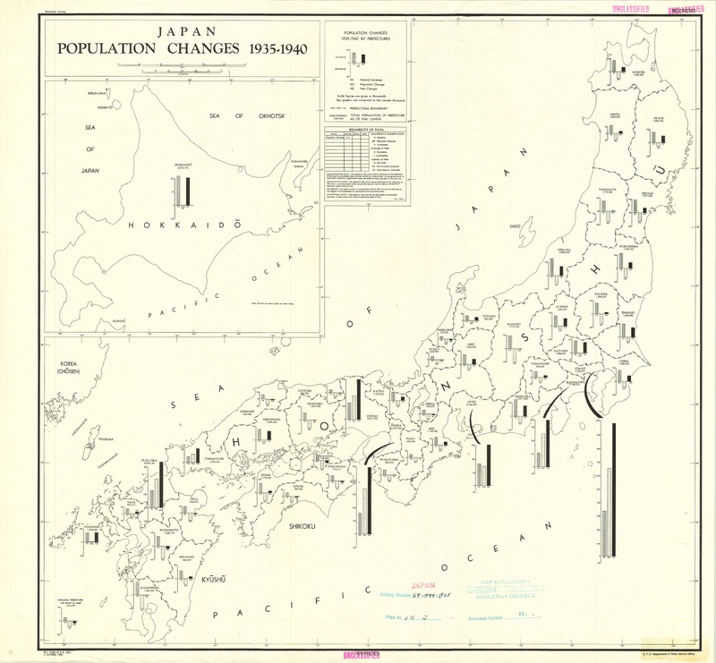 Japan Population Changes 1935-1940This map explains population changes across all prefectures in Japan from 1935 to 1940 by portraying a bar graph for each, showing natural increase, migratory change, and the resulting net change. Natural increase refers to population changes as the net result of births and deaths in the prefecture. Migratory change refers to population changes as a result of people migrating to and from the area. Finally, the resulting net change graphs the net changes in population taking into account both natural and migratory changes. The map delineates the Japanese prefectures, and each prefecture is labeled by name as well as with the total population of the prefecture as of the 1940 census. It includes the 4 main islands of Japan (Kyushu, Shikoku, Honshu, and Hokkaido), though Hokkaido appears as a scaled insert on the map and is not in its true location. There are also a few places on the maps that are labeled with their name but not population, such as Korea, Sado, and Tsushima. The map features the population change bar graph for Okinawa but does not include the island in the area covered. The reliability of the data is included under the key. According to the Department of State Services Office (G.P.O.), under the OSS Research and Analysis, the data has been deemed Reliable and Complete, as denoted by “R-C.” An overall trend in the data is migration out of rural prefectures and migration into urban prefectures. Though all prefectures experienced natural increase within the time period, most rural prefectures experienced a net decrease in population due to migratory change. In contrast, urban prefectures (Tokyo and Osaka, for example) experienced a large net increase in population.
 -
Japan Spring AreasA map of Japan, the Japan Sea, the Pacific Ocean, Hokkaido, and cold and hot springs and spas located therein.
-
 Nansenbushū bankoku shōka no zuThis map was originally wood block printed in 1710 was made by the Kegon monk Hōtan and published by Bundaiken Uhei. It describes the world based on Buddhist literature from India and China and was the first Japanese printed map to depict Europe, North America, and South America through a Buddhist perspective. Near the center of the map are four animal heads with the four great rivers in Buddhist cosmology coming out of their mouths in a spiral. The oval-shaped continent depicting modern-day India and China, Nansenbushū, is said to be the locus of human existence. Although India is still the biggest country in this map, Japan is added and is depicted as bigger than it actually is. In previous manuscript maps of the Buddhist worldview based on Xuanzang’s pilgrimage, depictions of Japan were typically much more simplified and smaller. Perhaps the map maker wanted Japan to be seen as more important in the Buddhist world than it had been before and thus depicted it in this way. Additionally, even though the map does depict Europe, North America, and South America, it makes an effort to keep them on the periphery of the map, which keeps the focus on a more traditional Buddhist cosmology. Interestingly, there are also some clearly fictional islands, like the land of the people with holes in their chests and the land of western women, which may suggest an effort to ignore certain information from existing world maps.
 -
OtawaraPrefectural map used to accurately assess topography and elevation
-
 Saihan Shinkai Oedo EzuThis map of Edo, titled Saihan Shinkai Oedo Ezu, was published and distributed to the public between 1818 and 1829 by Nichimura Soichi. Unlike most modern maps, its orientation is unconventional: North is to the right, South to the left, and West appears at the top. Three merchant ships are present in Tokyo Bay in the southeast, as well as ports in the bay and bridges over the Arakawa River. The legend shows distances from Nihonbashi in the center to multiple shrines and temples. It also shows the hierarchy of the city by defining symbols for residents from different social classes. At the center of the map is a large blank area marked with the Tokugawa crest, symbolizing Edo Castle. Various symbols across the map indicate the locations of samurai residences, revealing their distribution throughout the city. The most prominent samurai residences are marked by a crest, while other residences are marked by a circle or a square. Notably, a concentration of samurai families is found in the western part of Edo. This cartographic spatial arrangement reflects the hierarchical structure of the city, with the samurai and elite classes residing in the West, or the High City, Yamanote, while merchants and traders were primarily located in the East, or the Low City, Shitamachi. Despite its emphasis on residency, this map was primarily used by travelers who were visiting Edo. The map’s key points out the location of several temples across the city, which were seen as cultural hubs and places for festivities and entertainment.
 -
Shonin Ichidai DochūzuThis Edo-period Japanese “life journey” map employs geographic visualization to demonstrate the ways to achieve an ideal moral life. The map’s apparent vertical orientation symbolically elevates virtue and enlightenment at the top, while undesirable states or moral failings are relegated to the bottom. Six pathways intersect at the “crossroads of six realms,” labeled at the map’s center. One’s journey would begin at Mount Imose (representing a “primitive” status), which is located at the bottom of the map. All six paths inevitably encounter several obstacles, including “luxury bridge,” “adultery valley,” and “prostitution hills”. The map forces these challenges to be transcended to reach the top of the map, where five Confucian virtues are represented by mountains: benevolence, righteousness, propriety, wisdom, and trustworthiness. More notable features embodying Confucian values can be identified via moralized topography, such as “Mount Filial Piety,” “Mount Honesty,” and the “Hall of Great Learning” (a structure in the top left appearing to provide direct access to the five mountains of virtue). This map enjoins Confucian ideologies, using an imaginary spatial journey to show how a moral life can be perfected over time. The idea of multiple “realms” accessible from the crossroads may suggest the influence of Buddhist cosmological beliefs. In this map, the roads to the final goal are circuitous, and the definition of success is multidimensional.
-
 Sumba Island Military Geography Map (No.2)The map is a Japanese intelligence map of Sumba Island (part of the Lesser Sunda archipelago in Eastern Indonesia) during WWII. This is a three-timing map with layers made at three different times. The oldest layer is the base map by the Dutch Colonial Mapping Agency, done based on a 1934-1935 survey. This layer has the outline of the island of Sumba, dense contour lines, rivers, roads, trails and paths, and regions and features labeled in Dutch. The next layer is the Japanese Sixteenth Army reprint of the map from 1942, created when the Japanese invaded the island and captured the Dutch map; the 1942 reprint includes a Japanese title, secrecy classification, and a translated legend. The third layer of the map is another Japanese reprint from 1944 which has extensive notes about Japan’s troop placements, potential enemy landing sites, and other military information. This overlay includes handwritten notes in blue ink (information crucial to the occupation) and red ink (possible future enemy movements). The secrecy classification was also increased in 1944 to “top military secret”. We especially note the historical context that Japan was considering invading Australia, which is fairly close to the Sumba Island. Additionally, by 1944 the United States had begun its “Island Hopping” campaign and were capturing key Japanese-controlled islands to disrupt Japanese sea routes and push towards the Japanese mainland. The map depicts potential landing spots for the enemy, indicating that the army which revised this map may have believed Sumba to be a potential target for the Allies.
 -
 Sunbatō heiyō chishizuThe Japanese Land and Survey Department adapted this gaihozu map from a Dutch Colonial Topographic Mapping Agency map in 1942 and 1944. The original Dutch map was produced in color and printed in 1930. This map is the 9th sheet of a 13 sheet map series for Sumba Island. Scaled from 1:100000, the map is categorized as a “three-timing map” as the cartography visually depicts the changes made during Dutch and Japanese control. Both Dutch and Japanese languages are present. Between 1942 and 1944 the military classification of the map was upgraded from secret to top secret. The original Dutch publication contains labels of land areas/bodies of water in Dutch, water shaded in blue, and topographic contour lines to represent the elevations of different areas. The first Japanese overlay published in 1942 details more specific topographic information with an added legend depicting symbols for roads, pedestrian routes, rivers, land features, etc. One of the specifically emphasized symbols of this edition is the road traced with a thick red line, running East/West, identified by the legend as spanning 2-4 meters in width. This road was likely marked as an important transportation route. The modified 1944 version includes blue and red annotations to illustrate Japanese and enemy movements, respectively. Among these annotations is information in red about possible enemy landing sites and a note saying that an airport would be difficult to build and require a lot of effort due to the area being covered by wetlands.
 -
 Town Plan of ToyohashiThe OSS Research and Analysis Branch produced this English US Intelligence map on July 19, 1944. This wartime map depicts a relatively large-scale, detailed urban plan of Toyohashi, a city located on the coast of Japan. Created at the end of World War II, the map was based on an existing Japanese map of Toyohashi from 1927, reflecting military intelligence efforts to document Japanese infrastructure. An inset map in the upper left corner shows Toyohashi’s location in relation to broader East Asia, placing this town in a greater geopolitical setting. In the map legend, a scale is provided which measures distances in both meters and yards. The layout emphasizes strategic urban features through clearly defined legends: built-up areas are shaded in gray, identified buildings and areas are marked in maroon, and military areas are marked with a dark gray border. In labeling facilities, as well as shading in the identified buildings and areas, the map maker makes an effort to highlight important economic, governmental, and community institutions including fish hatcheries, markets, government halls, schools, temples, and the local hospital. Transportation routes are identified separately in the legend as 3’6” gauge railroad, electric railroad, and tramway. Roads are also depicted, as well as bridges, and a ferry route over the Toyokawa River. Water is marked as light blue regions, and the rivers are portrayed in great detail, including the embankments along the Yagyu River at the bottom of the map.
 -
 スンバ島兵要地誌圖 (第十四號)Strategic Map of Sumba Island 14/14 is a gaihōzu (Japanese intelligence) map. The map has color, is 0.6m x 0.6m square, and covers the Southeastern most corner of Sumba Island. Strategic Map of Sumba Island 14/14 is a three-timing map. The Dutch printed the underlying layer in 1930. The Japanese captured the map in 1942 when Japan colonized the Dutch East Indies. The Japanese General Staff Office; Land Measurement Department originally classified this map as “secret” (秘) when it was published in 1942, but the blue annotation in the right margin upgraded its status to “top secret” (極秘) in 1944. This may reflect Japan’s increasingly tenuous position as the Allied powers began to pressure its Pacific colonies later in WWII. The map features many markings in red and blue ink, which signify information pertaining to potential enemy invasion and Japanese defense respectively, which were added in 1944. The blue is information for and about the Japanese military (e.g. roads, mater supplies, camping capacity) and the red refers to potential enemy attack positions (ex. “Landing possible at low tide”). The map communicates basic geographic information through contour, topographical lines, and symbols to denote coastlines, elevation, and terrain features. Furthermore, roads, settlements, and landmarks are presented across all of the layers, listing them in a combination of Dutch and Japanese names. The key at the bottom explains symbolic representations of natural resources, infrastructure, and people. The map is in Dutch, but the Japanese notes refers to locations in Katakana, making it hard to find the exact location they are referring to (e.g. “メロロ” is mentioned multiple times, but we are not sure where it is on the map).